
Operating System
Transforming complex financial data into engaging visuals builds stakeholder trust and drives better decision-making. These 10 creative dashboard approaches leverage modern tools to turn numbers into actionable insights that resonate with any audience.
AI-Powered Narrative Visualizations with Power BI
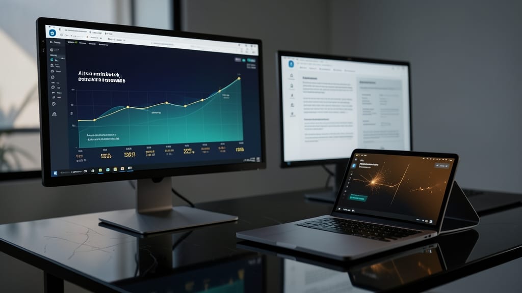
Tired of spending hours crafting executive summaries that feel stale and disconnected from your data? Power BI’s AI-powered narrative visualizations turn raw financial numbers into compelling stories—automatically. This feature uses natural language generation to highlight key trends, explain anomalies, and tailor insights to your audience’s priorities, all while dynamically updating as your data changes.
With Power BI’s Q&A visuals and AI-driven insights, you can create dashboards that don’t just display data but explain it. For example, the Narrative Visualization tool generates concise, professional summaries like, “Revenue grew 12% YoY in Q3, driven by a 20% increase in North American sales—despite a 5% dip in Europe.” You can also integrate dynamic text boxes that adapt to user selections, ensuring every stakeholder sees the most relevant insights first.
This is a game-changer for finance teams, executives, and data analysts who need to communicate complex trends without jargon. Whether you’re prepping for a board meeting or sharing quarterly updates, Power BI’s AI handles the heavy lifting so you can focus on strategy. ✨
Interactive Geospatial Heatmaps Using Tableau
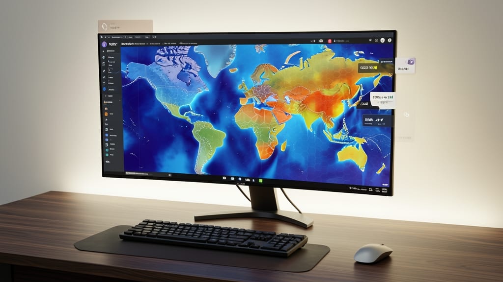
Tired of static spreadsheets failing to show regional financial patterns? Tableau’s geospatial heatmaps transform raw location data into intuitive, color-coded visuals that reveal hidden opportunities—like identifying high-revenue postal codes or underperforming retail zones at a glance.
This tool lets you overlay real-time financial metrics (sales, foot traffic, or inventory levels) onto maps with drill-down capabilities, so you can click from a national view down to individual store performance. The color gradients (blue to red) instantly highlight outliers, while filters let you isolate variables like seasonality or economic regions. No coding required—just drag-and-drop.
Ideal for real estate investors spotting market trends, retail chains optimizing store placements, or supply chain teams mapping logistics costs. With Tableau’s public sharing feature, stakeholders can explore insights on any device without complex setup. ✨
Gamified Financial Progress Trackers with Excel
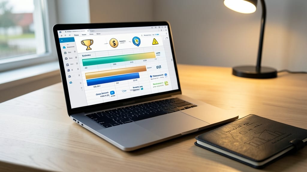
Tired of staring at static spreadsheets that make budgeting feel like a chore? Excel’s gamification tools turn financial tracking into an engaging challenge—no coding required.
Use conditional formatting to create visual progress bars that fill as you hit savings goals, then add custom icons (like checkmarks or badges) to celebrate milestones. For team-based budgets, leverage Excel’s Sparklines to compare performance side-by-side, sparking friendly competition. The best part? These features work in Excel 365 with zero add-ins—just built-in functions like IF() and CONCATENATE() to automate rewards.
Perfect for small businesses tracking quarterly goals or families teaching kids about budgeting, this approach keeps motivation high while making data intuitive. 💪
Real-Time Stock Market Simulations with Python

Want to teach trading strategies without risking real money? Python’s ccxt library connects to live exchanges like Binance or Coinbase, pulling real-time price data to simulate trades with zero latency. You can test strategies against historical data or live markets while adjusting risk parameters via interactive sliders.
The backtrader framework adds even more power, letting you code custom indicators and backtest portfolios with 100+ built-in algorithms. Visualize performance with candlestick charts, drawdown metrics, and even add machine learning models to predict trends. For educators, this turns abstract concepts like volatility or diversification into hands-on experiments.
Perfect for finance students, self-directed traders, or portfolio managers who need to stress-test strategies before deploying capital. 💻
3D Financial Model Visualizations in PowerPoint
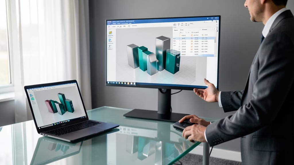
Tired of flat financial slides that put audiences to sleep? PowerPoint’s 3D Model tools turn spreadsheets into dynamic investor pitches with rotating charts and embedded video walkthroughs—no coding required. Simply import Excel data, convert it into a 3D bar or column chart, and add animations like "morph" transitions to show growth over time.
The real magic happens with embedded video walkthroughs: Record a quick screen capture explaining key metrics, then overlay it directly onto your 3D model. Investors love seeing animated revenue projections or interactive expense breakdowns—tools like PowerPoint’s Morph and 3D Rotation make complex data feel tangible. For extra polish, use PowerPoint’s Presenter View to control animations remotely during live pitches.
This approach shines for startup founders, real estate developers, or CFOs pitching to non-technical stakeholders. The zero-learning-curve makes it ideal for teams already using Microsoft Office. ✨
Voice-Activated Financial Summaries with Google Sheets

Tired of scrolling through dense financial reports while juggling calls or meetings? Voice-activated Google Sheets lets you query data hands-free using natural language—no keyboard or mouse required.
With the Google Assistant integration and Apps Script automation, you can ask questions like "Show me Q2 revenue by region" or "Compare last quarter’s expenses to budget" and get instant, formatted responses. The mobile app syncs seamlessly with your desktop sheets, and voice commands work offline for critical data access. For executives on the go, this eliminates context-switching between devices and apps.
Perfect for road warriors, board members, or analysts who prefer verbal data exploration—especially when reviewing reports during commutes or client calls. 💻
Comparative Benchmarking with Canva Infographics

Tired of dry spreadsheets drowning your competitive advantage? Canva’s infographic tools turn financial benchmarking into dynamic, shareable visuals that actually wow stakeholders—no coding required.
Start with pre-built financial templates (like revenue growth or market share comparisons) and customize them with animated transitions (e.g., smooth bar chart morphs) and color-coded benchmarks to highlight your wins. The drag-and-drop interface lets you swap data in seconds, while export options (PDF, PNG, or even animated GIFs) ensure your presentation sticks. Pro tip: Use the Canva Magic Design feature to auto-generate layouts from uploaded spreadsheets.
This is the go-to for marketing teams pitching against competitors or startups needing quick, polished comparisons. No need for PowerPoint jargon—just clear, compelling visuals that make numbers tell a story. ✨
Predictive Forecasting with R Shiny Apps

Tired of static spreadsheets that can't keep up with real-world changes? R Shiny Apps transform financial forecasting into dynamic, interactive experiences that adapt to new data in real time.
With automated data refreshes and slider-based scenario planning, you can instantly test how inflation rates, interest changes, or market shifts impact projections. The open-source framework integrates seamlessly with R's forecasting libraries (like forecast or prophet), while the drag-and-drop UI builder requires no coding knowledge to deploy dashboards. Even non-technical teams can adjust assumptions on the fly and visualize outcomes with confidence intervals.
Perfect for finance teams, economists, or small businesses needing agile forecasting without expensive enterprise tools. The zero-config deployment makes it ideal for quick pivots when economic conditions change unexpectedly. ✨
Collaborative Financial Storyboards in Miro

Tired of financial brainstorming sessions where everyone stares at static spreadsheets? Miro’s collaborative storyboards turn financial data into a dynamic, interactive whiteboard experience that keeps teams engaged.
With real-time annotation tools, you can overlay financial charts with sticky notes, connect data points with flowcharts, and even embed live spreadsheets—all while multiple team members contribute simultaneously. The pre-built financial templates (like cash flow diagrams or KPI trackers) cut setup time, and integration with PowerPoint and Excel ensures your insights stay actionable. No coding required!
Perfect for finance teams running strategy sessions, startup founders pitching investors, or educators teaching financial concepts—this tool makes complex data feel like a shared brainstorm, not a presentation. ✨
Augmented Reality Financial Walkthroughs with Unity

Tired of static spreadsheets failing to impress investors or clients? Unity’s AR tools let you turn financial data into an interactive, real-world experience—like walking through a building while seeing revenue heatmaps overlay its floors.
With Unity’s AR Foundation and ARCore/ARKit, you can place 3D financial models in physical spaces, making metrics like occupancy rates or cost-per-square-foot tangible. Add touch gestures to drill into details—like tapping a room to see its profit margins—while Unity’s Visual Effect Graph creates dynamic animations for trends. No coding required with Unity’s Visual Scripting for non-developers.
Ideal for real estate developers pitching properties or facility managers showcasing operational costs, this approach leaves spreadsheets in the dust. 💡